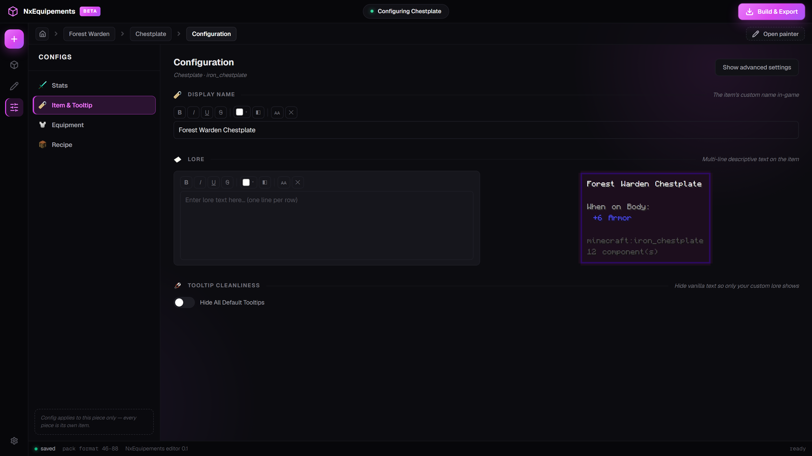
Item & Tooltip tab
The name, the lore, and how the tooltip looks when a player hovers your item.
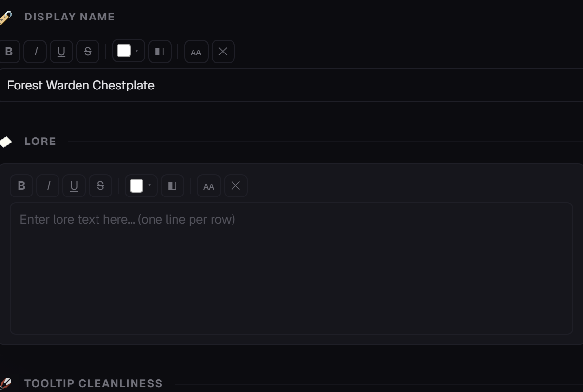
Display Name and Lore
Display Name is what the item is called in game. Leave it empty to use the piece name.
Lore is the description under the name. Each new line you type becomes a new line in game.
The formatting bar
Both boxes have a small toolbar above them. Select some text first, then click a button.
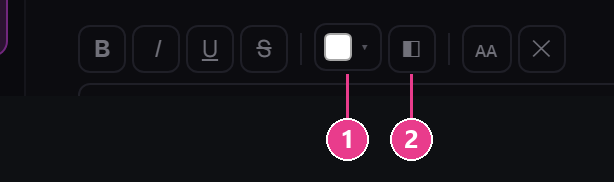
- Text color — 22 preset colours, plus Custom for any colour you like.
- Gradient — fades the text between colours. Add up to 6 stops, then press Apply.
| Button | Effect |
|---|---|
| B | Bold |
| I | Italic |
| U | Underline |
| Strikethrough | |
| ᴀᴀ | Small caps |
| ✕ | Strips all formatting off the selection |
The live preview
Name colour, lore, enchantments, the “When on Body:” stat block — all of it. Use this instead of rebuilding to check your work.
Tooltip Cleanliness
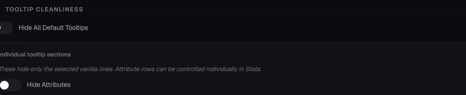
Hide All Default Tooltips removes every vanilla line so only your name and lore show. Good for a clean, custom look.
With advanced settings on you get finer control instead — separate switches for Attributes, Enchantments, Durability, Unbreakable, Repair information, Glider information and Damage resistance.
Advanced: Custom Tooltip Style
Replaces the tooltip's purple border with artwork of your own. Turn on Enable Custom Tooltip Style, then:
- Background Texture — click Upload PNG and pick the fill behind the text.
- Frame Texture — the border drawn around it.
- Border Size (px) — how thick the frame's edge is. 4 is a good start.
- Animation Speed (Ticks Per Frame) — leave empty for a still tooltip.
- Stretch Texture To Fit — on stretches the art, off tiles it.
To animate it, stack the frames vertically in one PNG. The background and the frame animate independently.